
In today’s bedroom design trends, the most memorable spaces don’t rely on a single “hero piece.” Designers increasingly treat bedding as the room’s largest textile canvas—one that can add narrative, depth, and tactile comfort in a single move. Among the fastest-rising choices, Bohemian embroidered printed bedding stands out for its ability to combine vintage pattern storytelling with dimensional embroidery and the soft, light-absorbing richness of velvet-like handfeel.
This guide breaks down what designers look for when pairing retro motifs with velvet texture, why embroidery changes the way a print “reads” in real rooms, and how practical details like envelope pillowcases and inner-tie fitted sheets quietly solve everyday user pain points—especially for hospitality, short-term rentals, and high-turnover retail.
A common designer observation is that “visual style” alone doesn’t sustain a space—people stay loyal to what performs. In bedding, that means a product must look curated in daylight and feel comforting at night. Current market feedback from home textile buyers indicates that texture and easy maintenance rank alongside pattern and color when users evaluate quality. In practical terms, brands and B2B buyers are prioritizing:
Bohemian embroidered print bedding fits this “two-track” trend naturally: it offers room-defining artistry while still being built for repeat use and real-life routines.
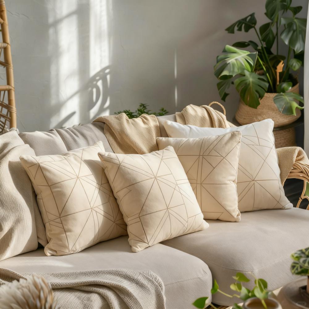
Designers often describe vintage patterns as “memory-friendly”: they trigger a sense of warmth, travel, and collected taste. But a flat print can sometimes look decorative rather than elevated—especially in larger repeats. That’s where embroidery changes the equation.
“A retro motif becomes more architectural when embroidery is layered on top. The raised lines catch side light, so the pattern gains depth—almost like relief work on fabric.”
— Interior Textile Designer, studio practice in residential + boutique hospitality
| Dimension | Traditional Printed Bedding | Bohemian Embroidered Printed Bedding |
|---|---|---|
| Visual Depth | Mostly flat; can look “graphic” from a distance | Raised stitch lines create shadow and highlight |
| Tactile Experience | Smooth surface; less sensory variation | Textural contrast (stitch + base fabric) feels crafted |
| Perceived Craft Value | Depends mainly on print clarity | Embroidery signals workmanship and premium finishing |
| Camera/Listing Performance | Can flatten under strong lighting | Stitches read clearly in angled light; more “dimensional” online |
For B2B buyers, that dimensionality matters because it supports higher perceived value without needing overly complex styling. In other words, the product does more of the aesthetic work by itself.
Velvet (or velvet-like finishes) is beloved for one reason: it absorbs and softens light, making colors appear deeper and more composed. When paired with a retro Bohemian motif, velvet texture acts like a “visual equalizer”—it keeps the look from feeling too busy while adding an inviting, cocooning mood.
When looking at your bedroom (or your customer’s room), which is the bigger challenge—too plain (no focal point) or too busy (no calm zones)? The answer determines whether you choose a high-contrast motif or a tone-on-tone embroidered print.

A beautiful set that slides, bunches, or exposes pillows quickly loses loyalty. Two small structural choices—envelope pillowcases and inner-tie fitted sheets (or inner buckle/tie systems)—often drive repeat purchases because they improve daily usability without changing the look.
Envelope closures avoid hard zippers and reduce snag risk. They also keep pillow inserts hidden, which makes a bed look “styled” even in minimalist rooms. For hospitality and rental operators, envelope pillowcases can shorten bed-making time; in operational studies across housekeeping workflows, time savings of roughly 10–20% are commonly reported when closures are simplified and standardized (depending on staff training and room layout).
Inner ties (or inner buckle straps) help keep the fitted sheet aligned—especially on deeper mattresses or for active sleepers. This is not a “luxury-only” feature; it’s a frustration reducer. Less shifting means fewer nighttime adjustments and a cleaner silhouette in morning photos, which matters for DTC product pages and B2B catalog imagery alike.
In a typical mid-size apartment bedroom (neutral walls, basic wood nightstands, standard overhead lighting), the space can feel clean but forgettable. Designers often solve this with one controlled “statement layer”: a Bohemian embroidered printed duvet cover in a warm palette, supported by calm solids.
Day 1: Add embroidered print bedding as the focal surface. Keep curtains and rugs neutral so the motif becomes the “art.”
Day 2: Introduce one accent material—aged brass lamp, rattan tray, or matte ceramic vase—to echo the Bohemian story.
Result: The room reads curated because the bed now carries pattern, texture, and narrative—without additional wall renovations.
The key is restraint: if the bedding is richly embroidered, designers often recommend one to two supporting colors elsewhere in the room—no more. This is how vintage pattern remains sophisticated rather than costume-like.

For Bohemian embroidered print bedding, the most reliable approach is to pick one “story color” from the motif and repeat it subtly around the room. This creates visual rhythm and keeps the eye relaxed.
Pair embroidered florals/medallions with clay, caramel, sand, and a small dose of deep olive. Works well for cozy, boutique-hotel moods.
Use dusty teal or smoky blue as the repeating accent; keep the rest in warm neutrals. Velvet texture helps jewel tones feel calm rather than loud.
If the print is intricate, add thin black lines in frames or hardware and keep bedding base tones light. This sharpens the look and modernizes the vintage motif.
If you had to choose one, would your customer prefer a high-contrast vintage statement for instant impact—or a tone-on-tone embroidered set that feels quiet and premium? Their answer often predicts return rates and repeat orders.
For international sourcing, buyers increasingly ask for third-party verification—not because they distrust suppliers, but because modern retail and hospitality compliance requires documentation. Many quality-focused home textile programs reference SGS testing and ISO-based factory management to support consistency across batches.
Note: Exact results depend on fabric composition, construction, and client requirements. B2B orders typically confirm standards and test plans per PO/spec sheet.
For wholesalers, retailers, and project buyers, the challenge is not just one beautiful set—it’s building a range that merchandises well. Designers typically recommend controlling repeat scale, embroidery placement, and color families so the collection looks intentional on a website category page or showroom wall.
If your customers want a bedroom that feels curated, warm, and premium—without sacrificing everyday practicality—Bohemian embroidered prints paired with velvet-like comfort are a proven direction. For distributors, retailers, and project buyers, consistency matters as much as style: reliable stitching, repeatable color performance, and details like envelope pillowcases and inner-tie fitted sheets that reduce complaints and returns.
Prefer a fast matching suggestion? Share your target market (US/EU/MENA), preferred color family, and bed sizes—and a spec-ready recommendation can be prepared for sampling and line planning.

 385
|
385
|
 Oeko-Tex Standard 100 Class II certification
International home textile export standards
Quality control system
Environmental safety certification
Home textile safety assurance
221
|
REACH compliance for textiles
CPSC safety standards
Oeko-Tex Class II certification
home textile export regulations
textile environmental testing
408
|
home textile export standards
quality control system optimization
Oeko-Tex certification benefits
REACH compliance in textiles
ISO 9001 for textile manufacturers
Oeko-Tex Standard 100 Class II certification
International home textile export standards
Quality control system
Environmental safety certification
Home textile safety assurance
221
|
REACH compliance for textiles
CPSC safety standards
Oeko-Tex Class II certification
home textile export regulations
textile environmental testing
408
|
home textile export standards
quality control system optimization
Oeko-Tex certification benefits
REACH compliance in textiles
ISO 9001 for textile manufacturers
 290
|
cotton pillow with quilted pattern
durable home textiles
PP cotton filling pillow
washable pillow cover
towel-style quilting technology
290
|
cotton pillow with quilted pattern
durable home textiles
PP cotton filling pillow
washable pillow cover
towel-style quilting technology
 211
|
adjustable arm desk lamp
ergonomic office lighting
LED task lamp for home office
anti-glare desk lamp
healthy lighting habits
211
|
adjustable arm desk lamp
ergonomic office lighting
LED task lamp for home office
anti-glare desk lamp
healthy lighting habits


